

1 Introduction
In our digitizing world where information is dense and time is scarce, images are increasingly used to communicate about complex issues [ Pandey, Manivannan, Nov, Satterthwaite & Bertini, 2014 ]. When communicating knowledge drawn from data, data visualizations such as graphs can be effective tools [ Szafir, 2018 ]. Graphs allow readers to easily explore the data, find relationships between the data, and draw conclusions from the data [ Curcio, 1987 ]. They depict easy to recognize trends of increase and decline over time and allow for efficient comparison between multiple variables, due to instant pattern recognition as an effect of our natural visual perception [ Shah & Hoeffner, 2002 ]. The ability of graphs to trigger this effect proved to be very valuable during the COVID pandemic, when graphs were used extensively to share complex and large amounts of information with a general public [ Jayasinghe, Ranasinghe, Jayarajah & Seneviratne, 2020 ]. However, there is a great drawback to this powerful way of communicating: the ease of being misled.
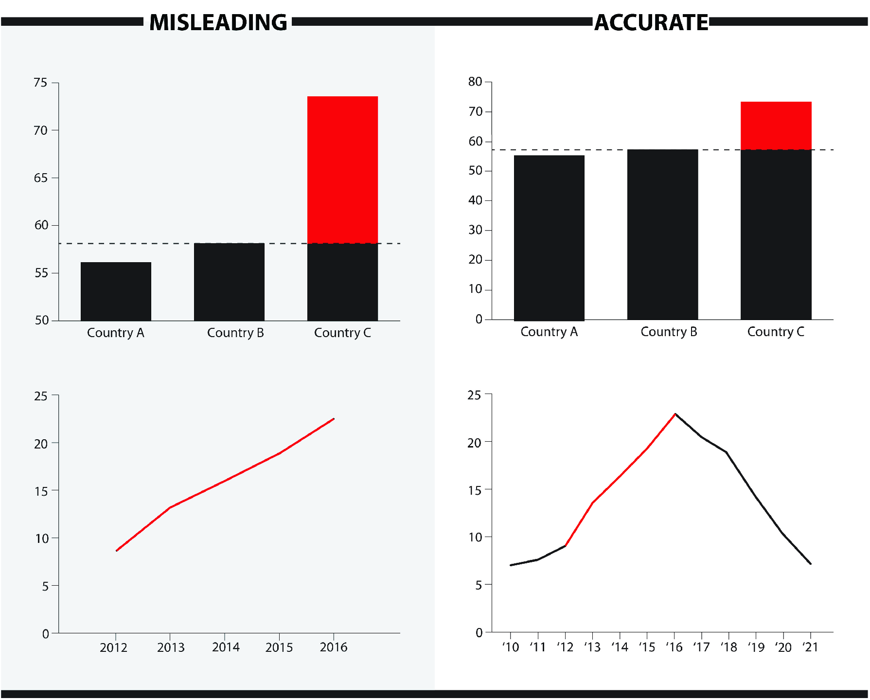
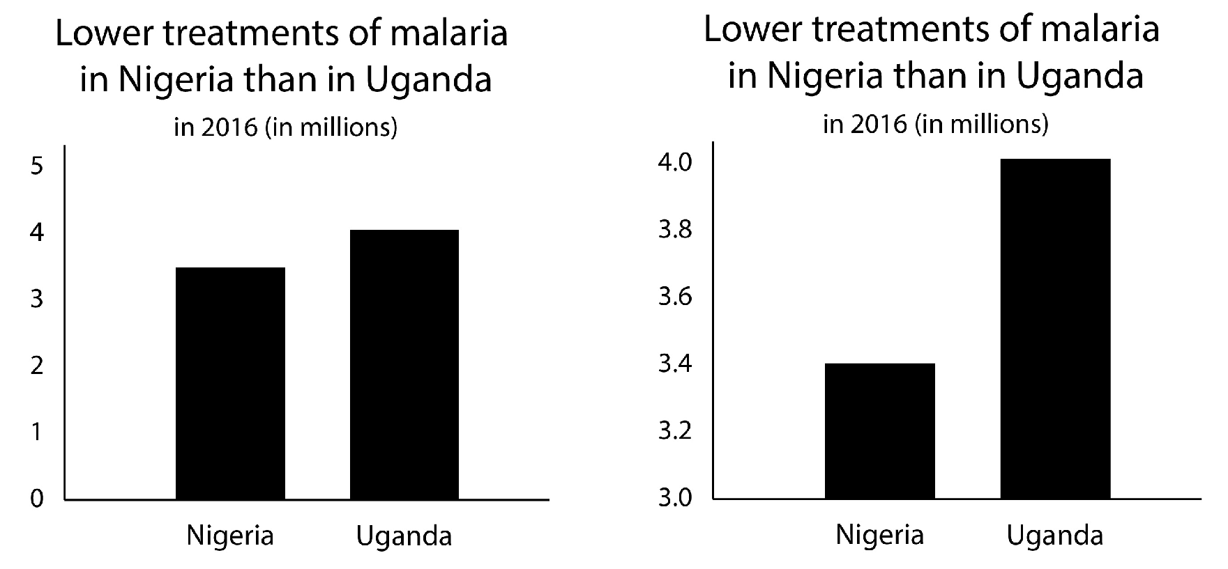
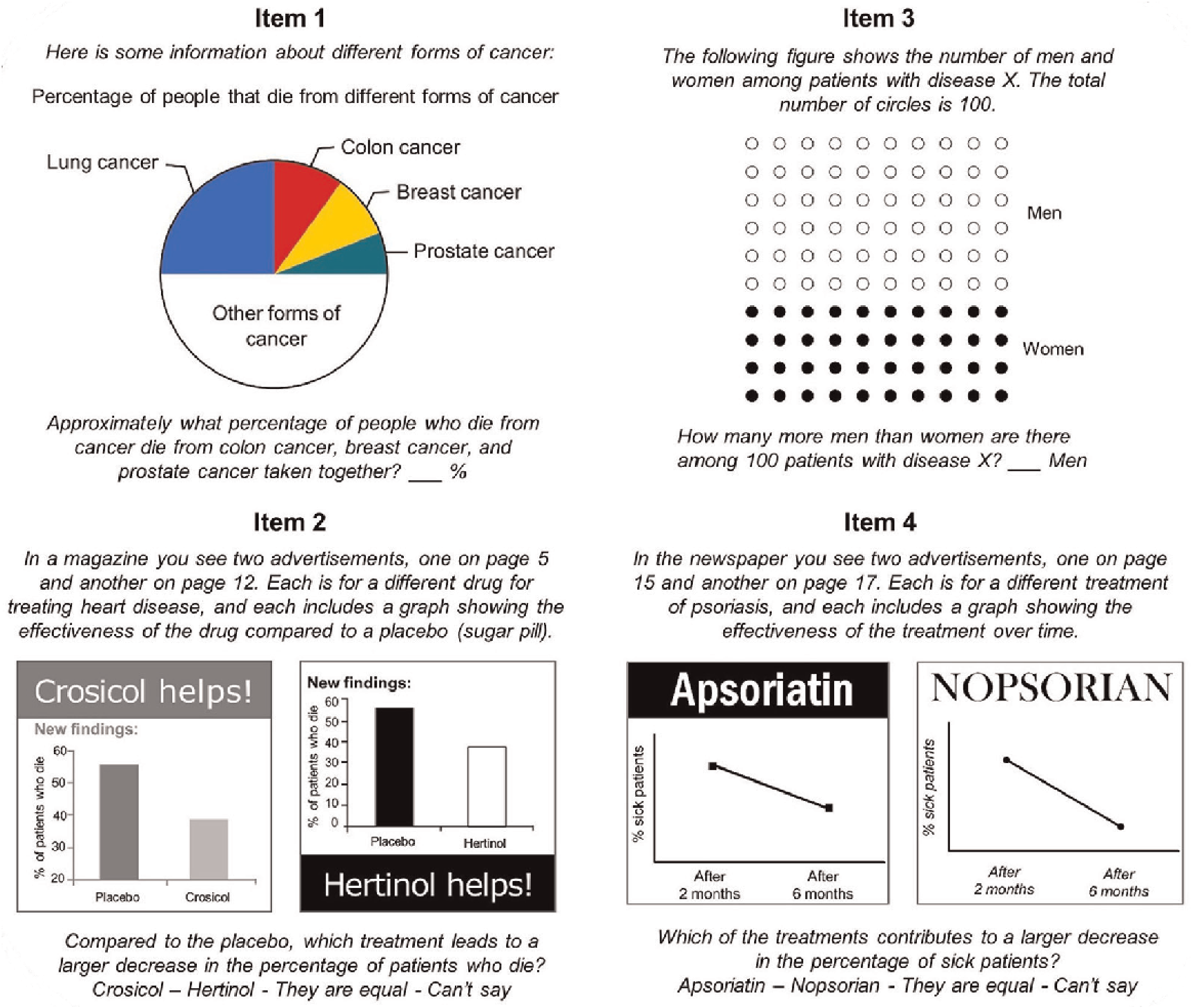
People consume information on a daily basis both online and offline, and incorrect, incomplete or deceptive messages can be hard to recognize. In fact, online media are swamped with questionable news items and different kinds of inaccurate data visualizations, and it is up to the users to evaluate the truth and value of these while quickly skimming new posts [ Pennycook, McPhetres, Zhang, Lu & Rand, 2020 ]. And the users are not necessarily highly literate when it comes to reading graphs and understanding numbers, making some people more vulnerable to misinformation [ Szafir, 2018 ]. Notorious examples of graphs that intentionally or accidentally deceive their readers, are graphs with a cut-off y-axis that does not start at zero (also referred to as an omitted baseline) causing the area of the bar no longer to reflect the amount it represents, or that cherry pick data by leaving out inconvenient trends (see Figure 1 , and see footnote references for recent real-life examples). 1
To counterbalance the spread of misinformation in online media and to help readers recognize it, factcheckers are using these same media channels to debunk misinformation [ Nieminen & Rapeli, 2019 ]. Research on how to factcheck efficiently has already resulted in some general guidelines on how to present the factcheck, and some practical recommendations such as not to repeat the misleading message and to use short messages rather than simple retractions [ de Sola, 2021 ; Ecker, O’Reilly, Reid & Chang, 2020 ; Walter, Cohen, Holbert & Morag, 2020 ; Young, Jamieson, Poulsen & Goldring, 2018 ]. However, since the literature focusses on textual information, still little is known about how to debunk misinformation presented visually. In this study we investigate how to effectively counter graphs that give a biased impression of the underlying data, e.g., by providing a better graph or a clear explanation.
In our theoretical framework we discuss three important aspects to consider when debunking misleading graphs. Firstly, we look at conventions in graph design and the psychological processes involved in graph perception to understand how people are misled. Secondly, we focus on violations of design conventions to identify characteristics of misleading graphs. Finally, we consider what can prevent people from being misled and how to translate that into effective debunking strategies.
2 Theoretical framework
2.1 Graph design and perception
Reading a graph involves processing textual and numerical elements. A line graph or a bar chart, for example, preferably entails a title explaining what the graph is about, axes labels and/or axes values explaining the nature of the data, equally increasing intervals on the vertical axis, typically starting at zero (unless the data requires it differently) [ Franconeri, Padilla, Shah, Zacks & Hullman, 2021 ], and logically ordered (e.g. chronologically or alphabetically) values or units on the horizontal axis [ Cairo, 2019 ; Raschke & Steinbart, 2008 ; Tufte, 1983 ] (also see Figure 2 ).
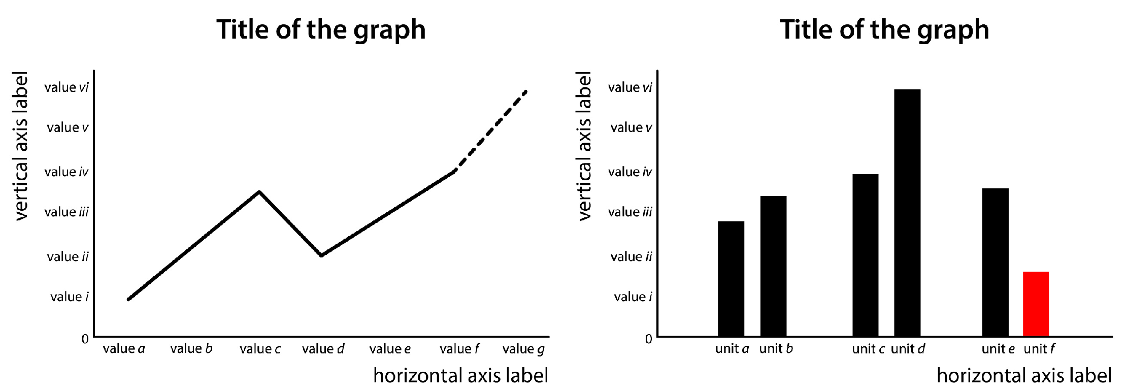
Apart from textual and numerical indicators, a graph entails shapes, lines, and colors. To communicate information through these visual elements, graph designers rely on humans’ intuitive or natural modes of perception, that for example tell us that a bigger shape equals a greater volume or amount, that objects close together are related, and that divergent colors or patterns require attention (see Figure 2 ) [ Bertin, 1983 ; Tufte, 1983 ].
Based on these perception mechanisms, graph design standards developed over time, which people learn to understand when reading graphs more frequently and through education [ Pinker, 1990 ; Shah & Hoeffner, 2002 ]. Examples of such design standards are that an upgoing line implies an increase, and that red elements warn for unfavorable trends or cases (in the Western world) [ Cleveland & McGill, 1984 ]. The expanding use of graphs and other types of data visualizations have led to additional more abstract rules on how to use the textual, numerical, and visual cues, such as striving for simplicity, selecting an appropriate color scheme, and enabling comparison between variables by using similar axis ranges in separate graphs [ Kelleher & Wagener, 2011 ]. Adhering to such conventions enhances the graph’s effectiveness and helps drawing correct information from the graph when reading it.
Reading and comprehending visual, numerical, and textual cues in graphs has been described as a two-phase process: first the phase of looking, followed by the phase of seeing [ Cairo, 2019 ]. This first phase covers a bottom-up automatic process of unconscious encoding of visual characteristics that is primarily controlled by the natural intuitive perception of visual elements. This phase leads to an initial categorization and qualification of the graph’s data, such as “there is an up-going trend” or “unit A performs better than unit B” [ Carpenter & Shah, 1998 ]. The second phase covers a top-down and more conscious process of analyzing data, labels, and axis values that refines the initial visual perception [ Raschke & Steinbart, 2008 ]. This process may repeat in cycles focusing on different elements [Carpenter & Shah, 1998 ]. Just as reading a text thoroughly yields more and more detailed information than when skimming it, looking closely at a graph leads to better comprehension [Cairo, 2019 ].
Although this process is assumed to occur with all readers of graphs, not everybody is equally capable of reading a graph closely. People’s abilities for close graph reading are referred to as graph literacy [ Curcio, 1987 ]. It involves the skills to read the data by deriving the correct values from the graph, to read between the data by comparing two points in the graph, and to read beyond the data by making an estimation of unpresented data based on the graph [Curcio, 1987 ]. People’s graph reading skills develop when reading graphs more often and through (formal) education [Raschke & Steinbart, 2008 ]. However, prior research has shown that people’s graph literacy need not be directly related to their educational level, and for example their ability to understand numbers (numeracy) e.g. [e.g. van Weert, Alblas, van Dijk & Jansen, 2021 ].
2.2 Misleading graph design
Numbers and graphs are associated with objectivity, but their presentation may be far from objective [ Pandey et al., 2014 ]. Accurate graphs are designed to optimally inform the reader and make it easy for the user to read them [ Cairo, 2019 ; Tufte, 1983 ]. However informative, graphs in news media are always used to tell a specific story — they are used rhetorically. Choices in the design of the graph can help to strengthen its rhetorical power. In this paper we speak of misleading graphs when graph design violates graph conventions to optimize its rhetorical power despite the data, and these graphs “[ …] lead us to spot patterns and trends that are dubious, spurious, or misleading [ …]” [Cairo, 2019 ]. In our information-dense digitizing world, images that enable fast and concise communication are highly welcomed, and misleading graphs take clever advantage of our hasty ways of news consumption. Hasty readers might not take the time to refine their initial visual perception of a graph and never reach the top-down conscious phase of processing the graph more closely. Even if they do take the time and effort, initial images appear to be quite persistent and difficult to refine [ Raschke & Steinbart, 2008 ]. When remembering the graph and what can be concluded from it, people tend to rely more on the visual impression it gave (e.g. “the trend is downward”) than on the actual data it presented [ Pennington & Tuttle, 2009 ].
Misleading graphs violate graph conventions as a means to control the reader’s initial perception in the phase of looking. Tufte introduced the “lie factor” describing the degree of exaggeration in a misleading graph [ 1983 ]. Cairo discriminates five ways in which graphs may be misleading — or lying as he puts it — being: by poor design, by displaying dubious data, by displaying insufficient data, by concealing or confusing uncertainty, or by suggesting misleading patterns [ 2019 ]. Bryan even comes to seven types of distortion including manipulations of color, composition, symbolism, affect, scale ratios, and the second or third dimension [ 1995 ].
Common violations of graph conventions are for example omitting the baseline (vertical axis does not start at zero), manipulating the vertical axis (e.g. not evenly spread), cherry picking data (leaving out data that does not support the desired story), inversion (e.g. using darker shades for low instead of high density), using 3D effects (exaggerating differences through depth effect) or otherwise unnecessary complex imaging, using the wrong graph (e.g. using a pie chart to present numbers that do not add up to 100%), or improper scaling (typically when an icon is used as a bar and the volume of the icon does not properly relate to the amount it should express) [ Kelleher & Wagener, 2011 ; Szafir, 2018 ; Tufte, 1983 ].
2.3 Supporting accurate perception
To support accurate reading when graph conventions are violated, we can try to intervene in the process of graph perception. Swire-Thompson et al. [ 2021 ] have shown that the effectiveness of a correction method depends more on its content than it form. Nevertheless, the theory described above suggests that form will be important if corrections are linked to the different stages of graph perception.
As can be concluded from the theory on the two-phased graph comprehension, deceit by a misleading graph follows from the initially perceived image, pattern, or trend derived from the graph in the first phase of looking. This initial image is notoriously difficult to adjust [ Pennington & Tuttle, 2009 ; Raschke & Steinbart, 2008 ]. We speculate that a strategy aimed at replacing this initial deceiving image with an accurate alternative might give enough counterbalance to overwrite or correct it and so support more accurate perception of the data. Alternatively, a different strategy aimed at more conscious analysis of the graph in the second phase of perception may also cause initial inaccurate reading to be corrected and lead readers to an accurate image of the data. When readers do not proceed to conscious analysis by themselves, it is assumed that they can be supported to do so by activating graph literacy knowledge, or by warning them for possible deceit [ Maertens, Roozenbeek, Basol & van der Linden, 2021 ; Pennycook et al., 2020 ; Raschke & Steinbart, 2008 ].
And finally, research has shown that repeatedly exposing people to factchecks could make people less susceptible to misinformation and make them more alert to deceit in general [ Clayton et al., 2020 ; Lewandowsky et al., 2020 ; Maertens et al., 2021 ].
2.4 Research questions and hypotheses: debunking strategies and protection from misinformation
To investigate how misleading graphs can be effectively corrected and to detect the determinants for effective debunking strategies, we set up an experimental study that involves the evaluation of misleading graphs with a design violation that is commonly used and relates well to the two-phase perception process, namely the cut-off y-axis in bar charts causing an exaggeration of differences between the presented units [ Szafir, 2018 ]. For a summary of the hypotheses and research questions, see Table 1 .
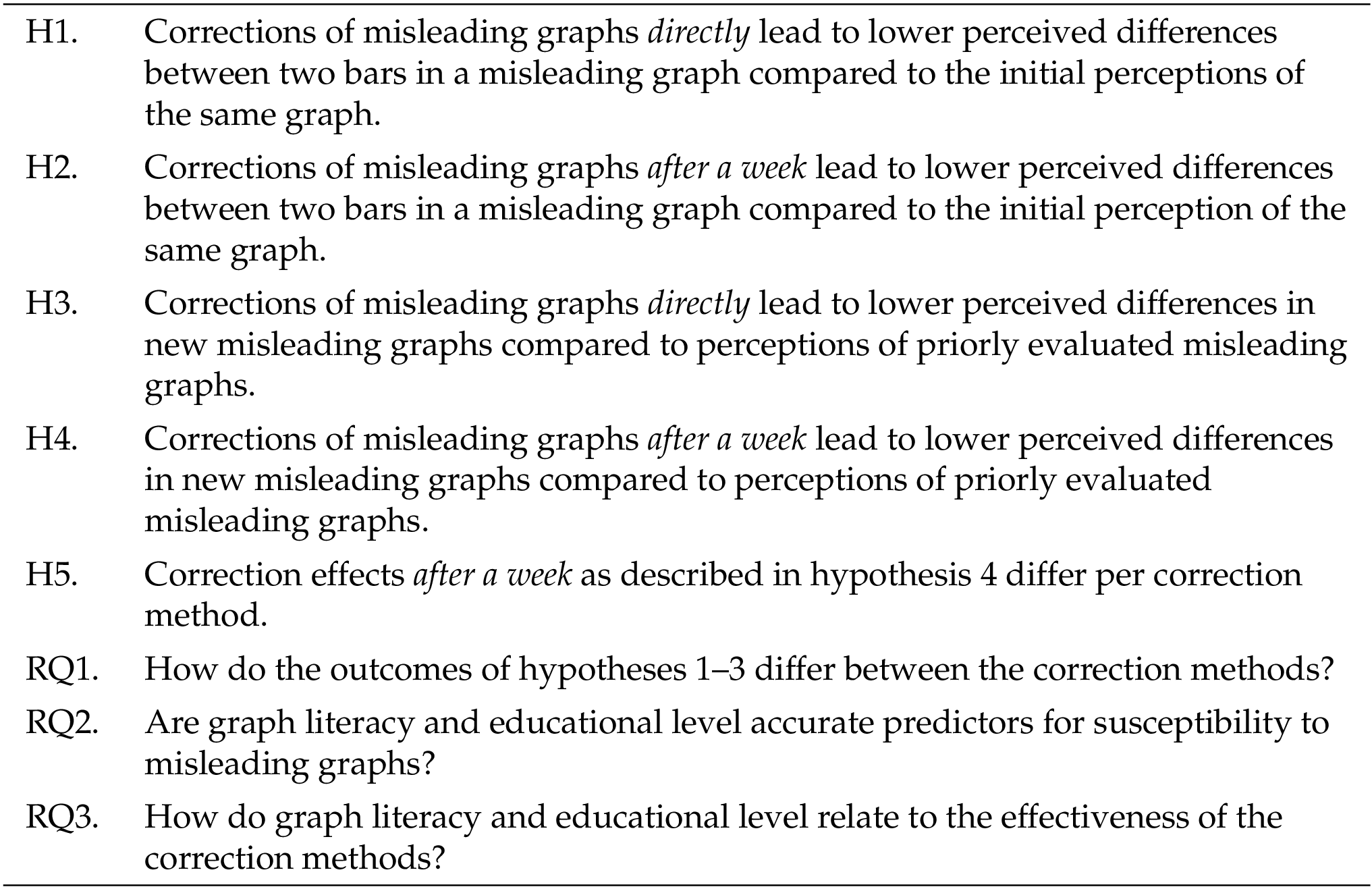
We developed four correction methods (see Instruments in Methods section) that aim to support accurate perception as a means to debunk misleading graphs. In line with the theory described above, the methods are either aimed at correcting the misleading initial perception in the first phase of graph processing, or at stimulating accurate reading and analysis in the second phase. We investigate whether they are effective for correcting the misleading image (H1), and whether these effects last for at least a week (H2). Additionally, we explore whether there are any differences between the correction methods for these two hypotheses (RQ1).
As discussed above, repeated exposure to factchecks possibly makes readers less susceptible to fake news [ Lewandowsky et al., 2020 ]. To see whether this effect too may be the case for corrections of misleading graphs, we investigate whether showing corrections also influences the evaluation of new misleading graphs (H3), and whether these effects last for at least a week (H4). Again, we explore whether there are any differences between the correction methods for these two hypotheses (RQ1). We test for significant differences between the correction methods for new misleading graphs after a week (H5), since a longer lasting effect would be the strongest indicator for protection against misinformation.
As an indication for possible future research, we explore to what extent both graph literacy and educational level are accurate predictors for people’s susceptibility to misleading graphs (RQ2), and how the effectiveness of the correction methods we propose relate to graph literacy and educational level (RQ3).
3 Methods
We performed an experimental study that involved two online surveys. The setup, hypotheses, research questions, and analyses were preregistered at AsPredicted.org ( https://aspredicted.org/GXV_54W ) and has been approved by the ethics review committee of Leiden University, the Netherlands, with reference number 2021-019. The data was collected using Qualtrics’ online survey software and participants were recruited online via Prolific. The collected data is stored under the following DOI: 10.17026/dans-zt5-qg5e .
3.1 Procedure
The study involved two online surveys that were filled in one week after another (on 18 and 25 January 2022) by the same set of participants. In the surveys, the participants were presented series of accurate, misleading, and corrected graphs that displayed two vertical bars in a chart. Participants were asked to evaluate the difference between the two bars on a visual analogue scale.
The second survey was used to measure the effect of time on the results. The delay between the two surveys was set to one week: not shorter to prevent retention of previous answers, and not longer to simulate the natural flow of disinformation and its correction in the media. It took the participants approximately 20 minutes to complete both surveys, and they were paid a total $3,20 (equals $9,60 per hour — the Prolific standard). All data was collected pseudonymized in the database of Prolific and presented anonymized to the researchers.
3.2 Participants
For this two-survey experiment, we recruited a total of 441 representative U.S.A. participants from the Prolific database that were pre-screened based on Prolific’s standard for a representative sample to secure variety for gender, age, and ethnicity (however, ethnicity was not considered in our study). The required sample size was derived from the power analysis we performed prior to data collection and conform the procedure described in the preregistration. Participants that did not finish the first survey were not paid for their contribution and thus were excluded from the analyses all together (not included in the number of 441 participants). Participants that did not finish the second survey were only excluded from the analyses that involve data from the second survey. Furthermore, we preregistered to exclude participants who finished the survey within 90 seconds (first survey) or 45 seconds (second survey) because we assume that they did not take the survey seriously. None of the participants needed to be excluded based on these grounds.
3.3 Instruments
3.3.1 The surveys
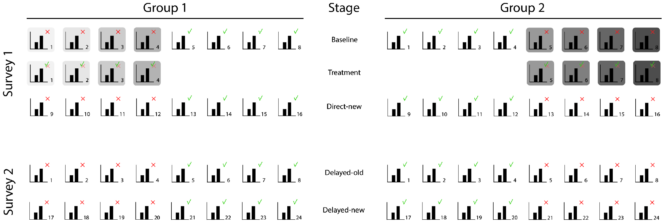
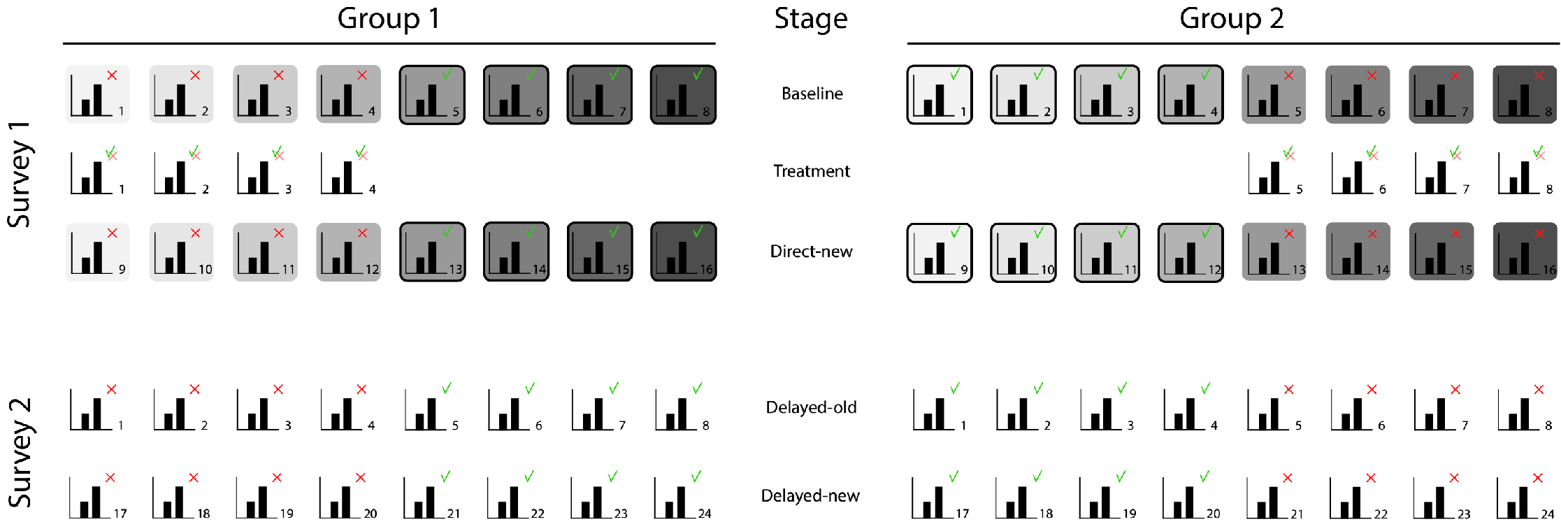
We created two surveys to test our hypotheses that measure the participants’ evaluations of graphs at five different stages. At the Baseline stage the participants evaluate correct and misleading graphs before any treatment is given (see Figure 3 ), at Treatment they evaluate corrections of the misleading graphs presented at Baseline, at Direct-new they evaluate new misleading graphs directly after the treatment, at Delayed-old they evaluate the misleading graphs of the Baseline stage one week after the treatment, and at the Delayed-new stage they evaluate new misleading graphs one week after the treatment. We divided the participants into two groups to equally divide the accurate and misleading graphs among them (group 1 was presented misleading versions of the accurate graphs presented to group 2, and vice versa).
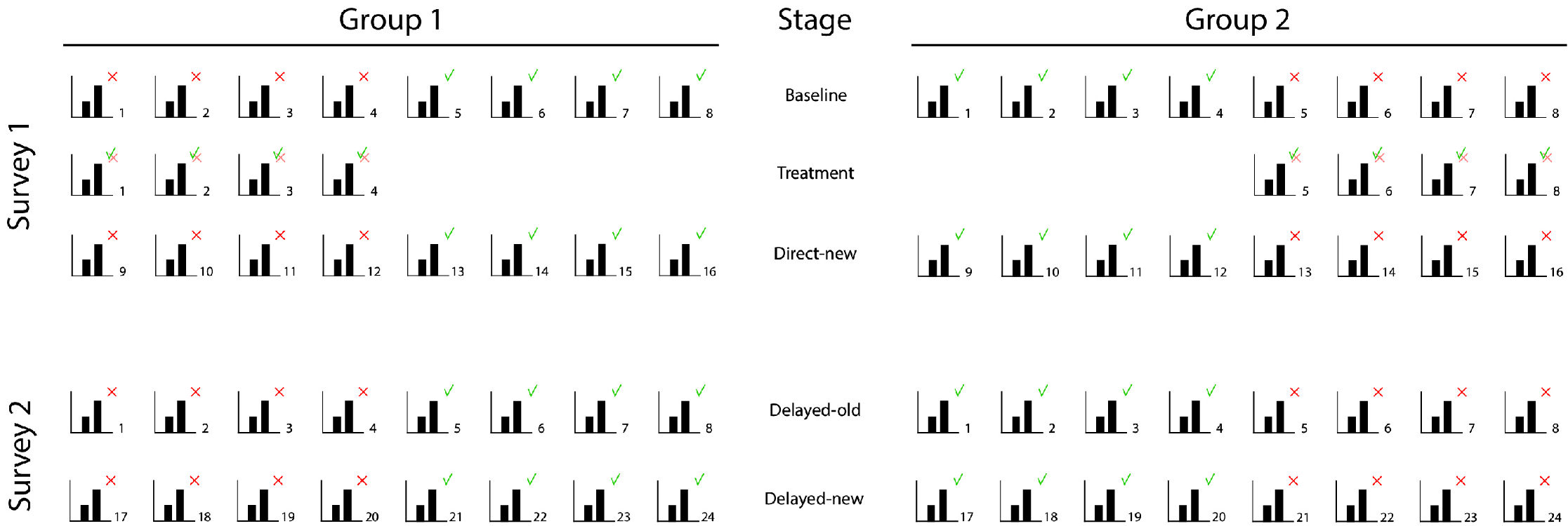
The first survey started with a question about the participant’s highest completed educational level. Next, the participants were presented a total of 20 graphs in three series representing the Baseline stage, the Treatment stage, and the Direct-new stage (see Figure 3 ). The Baseline stage contained four accurate and four misleading graphs in a randomized order. The Treatment stage contained in a randomized order corrections of the four misleading graphs that the participants were presented at Baseline. At this stage, each participant was randomly assigned one of the four treatments, being either one of the four correction methods we developed. The corrections were purposefully presented in a random order and not until after the Baseline stage was completed to avoid participants repeating their initial report for the linked misleading graphs. The Baseline measure ensured that no control group without treatment was needed. The Direct-new stage again contained four accurate and four misleading graphs in randomized order — all different from the ones at Baseline.
The second survey filled in one week later, consisted of 16 randomized graphs in one series representing the Delayed-old stage and the Delayed-new stage. The graphs representing the Delayed-old stage were the same first four accurate and misleading graphs the participants were presented at the Baseline stage. The graphs representing the Delayed-new stage were four new accurate and four new misleading graphs.
The randomization of accurate and misleading graphs was intended to prevent priming the participants about the misleading y-axis. After the second survey, the participants were debriefed about the graphs with the manipulated y-axes by presenting them correct versions of these graphs.
3.3.2 The graphs
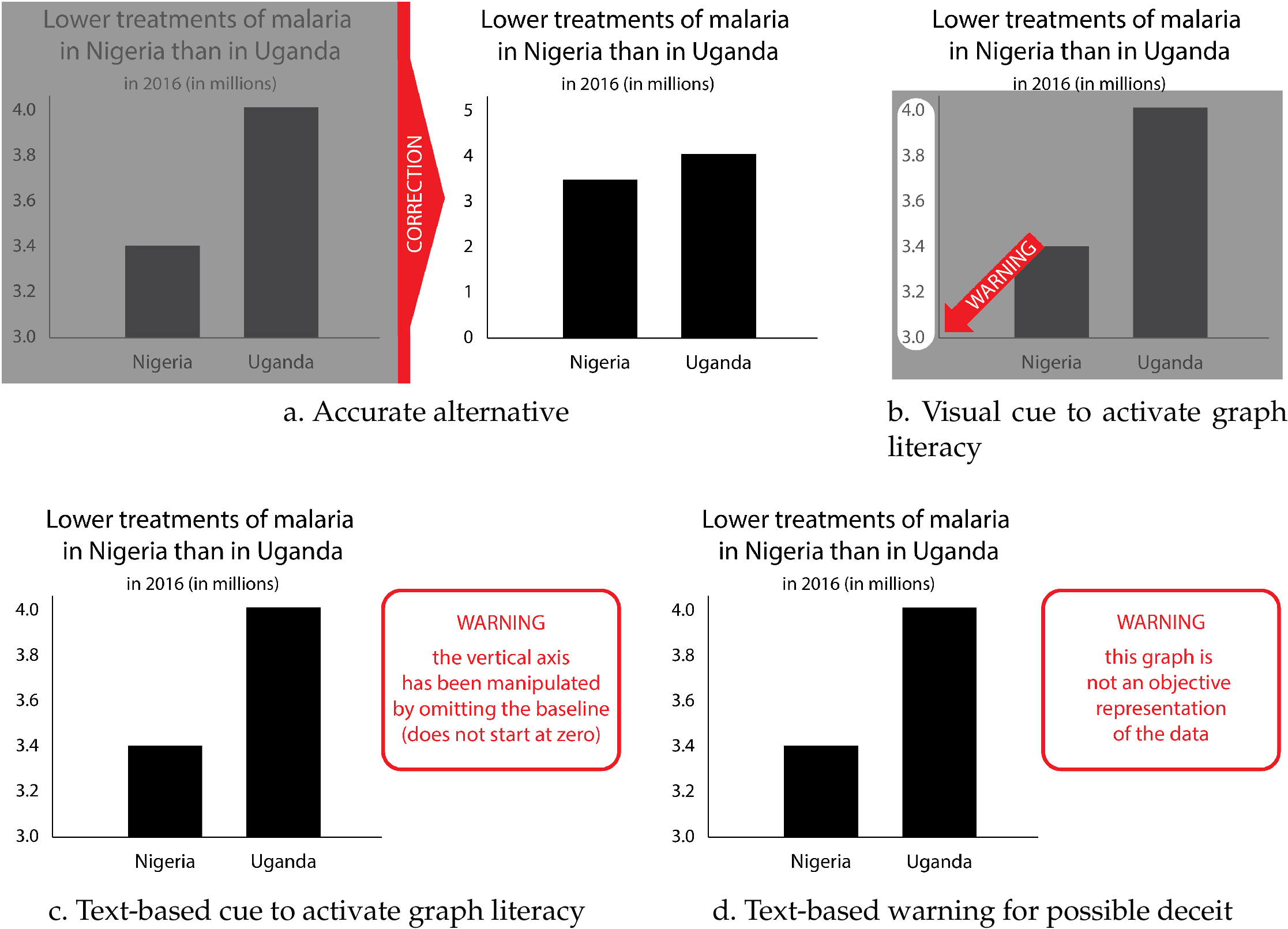
We created graphs for 24 unique contexts with real data from the World Health Organization. 2 Each graph compared two points in time or two categories on a real but non-current context, such as air pollution or infection treatments. The two bars all presented a percentual difference of 10–20% in each graph. Each graph was accompanied by a neutral statement that only indicated the direction of change or comparisons between groups, to simulate a realistic news media setting (e.g., “Increased concentration of particulate matter in air of Miami”). For each context we created an accurate graph (24 graphs) and a misleading graph with a manipulated vertical axis (24 graphs) (see Figure 4 ). For eight contexts we created four corrected versions of the misleading graphs ( graphs). This adds up to a total of 80 unique graphs.
We designed the corrected versions of the misleading graphs to match the aims of the debunking strategies described under Theoretical Framework to either correct the misleading image (correction method a), or to stimulate accurate reading (correction methods b, c and d), see Figure 5 for examples.
In the surveys, we worked with series of graphs on different contexts, so that for each participant we could take the mean of the evaluations of the graphs in one series and use that mean in the analyses (see Preregistered analyses) to minimize the influence of the context on the results.
3.3.3 Measures
We used a visual analogue scale (VAS) to have the participants evaluate the differences between the bars in the presented graphs, rather than Likert scales for example, to enable the measurement of small differences and to avoid participants remembering and repeating their exact prior evaluation of the same graphs. The VAS ranged from “very small” to “very big” and the center was indicated with the word “neutral”. For analysis, the outcomes were transcoded to values ranging from 0 (very small) to 100 (very big).
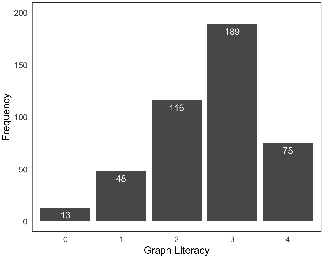
Our first survey ended with a graph literacy test. An often-used measurement for graph literacy is the 13-item graph literacy test developed by Galesic and Garcia-Retamero [ 2011 ]. The test is developed for a variety of graphs such as line plots, and bar and pie charts. To avoid lengthy questionnaires, Okan, Janssen, Galesic and Waters [ 2019 ] introduced the four-item Short Graph Literacy (SGL) scale, which is a shorter version that includes only four items (see Figure 13 in appendix A ) of the original 13-item test and proved to be a valid measure in comparison. We used the SGL test in our survey, and participants obtained one point for each correct answer (range of 0 points for lowest graph literates to 4 points for highest graph literates).
Furthermore, we introduce two new measures. The first is the Correction effect, and indicates the effectiveness of correcting a misleading graph. This effect is calculated by subtracting per context the evaluation of a misleading graph from the evaluation of the corresponding corrected graph to calculate the change in the evaluation per context for each participant. The higher the calculated score, the bigger the effect of correction. Per participant we used the mean of the four correction effect measures within each stage.
The second measure is the Misled score. This measure indicates the degree to which a person was deceived by a misleading graph in reference to the evaluations of the accurate graph on the same context by the other group. The misled score was calculated by subtracting the median 3 evaluation of the accurate graph by other participants from a participant’s evaluation of the misleading graph on the same context. Hence, a positive score indicates that a participant was misled; the higher the score, the more they were misled.
3.4 Preregistered analyses
Hypothesis 1. To test whether corrections of misleading graphs directly led to lower perceived differences compared to the initial perception of the same misleading graphs, we calculated the mean of the four correction effect scores (four misleading and corrected graphs) for each participant and tested in a one-sided one sample t -test whether on average these mean correction effect scores were indeed smaller than zero (see Figure 6 for visual support). 4
Hypothesis 2. To test whether corrections of misleading graphs after one week led to lower perceived differences compared to the initial perception of the same misleading graphs, we first subtracted per context the evaluation of the misleading graph at Baseline from the evaluation of the same misleading graph one week later to calculate the correction effect per context for each participant (see Figure 7 for visual support). Then we calculated the mean of these four correction effect scores for each participant and tested in a one-sided one sample t -test whether on average these mean correction effect scores were indeed smaller than zero.
Hypothesis 3. To test whether corrections of misleading graphs directly led to lower perceived differences in new misleading graphs compared to perceptions of priorly evaluated misleading graphs, for each participant we calculated the mean misled scores over the four misleading graphs presented at the Baseline stage as well as for the new misleading graphs presented at Direct-new (see Figure 8 for visual support). With a one-sided paired t -test, we tested whether on average the participants’ mean misled scores dropped significantly.
Hypothesis 4. To test whether corrections of misleading graphs after one week led to lower perceived differences in new misleading graphs compared to perceptions of priorly evaluated misleading graphs, for each participant we calculated the mean misled scores over the four misleading graphs presented at the Baseline stage as well as for the new misleading graphs presented one week later at Delayed-new (see Figure 9 for visual support). With a one-sided paired t -test, we tested whether on average participants’ mean misled scores were significantly lower after one week.
Hypothesis 5. We tested for significant differences between the correction methods after one week (as is done in hypothesis 4). For each participant we calculated the mean misled scores over the four misleading graphs presented at the Baseline stage as well as for the new misleading graphs presented one week later. We subtracted the latter from the former to calculate the difference in misled score per participant after one week (which we expected to be less than zero). On these differences we ran an ANOVA analysis to test whether on average there were any differences between the effects of the four correction methods. For significant analyses we performed post hoc comparisons to test which pairs of correction methods were significantly different.
We applied the Holm-Bonferroni correction to compensate for the five tests that we performed.
To further investigate any differences in the effects of the four correction methods, we used visualizations to get a first impression for the comparisons described in hypotheses 1–3 (following the preregistration).
3.5 Non-registered additional analyses
To develop ideas for further research, we preregistered our intention to explore possible correlations between the effectiveness of the four correction methods and the participants’ gender, education level, and graph literacy. We explored the correlations by applying a multilevel analysis. The model was built up step by step, first adding the variable of time, then correction method and finally the participants’ variables.
4 Results
4.1 Descriptive statistics: demographics, graph literacy, evaluations of the graphs and effectiveness of the misleading graphs
The first survey was filled in by 441 participants (51% female; aged 18–82, , ). The educational level of the participants was above the U.S. average: 5 1% had no formal education (U.S. ), for 20.6% high school was the highest completed level (U.S. ), 58% were under graduates (U.S. ), and 20.4% had a (post) graduate degree (U.S. ). The second survey was filled in by 400 of these same participants (comparable demographics as of complete sample). The distribution for the calculated graph literacy score of the participants is presented in Figure 10 .
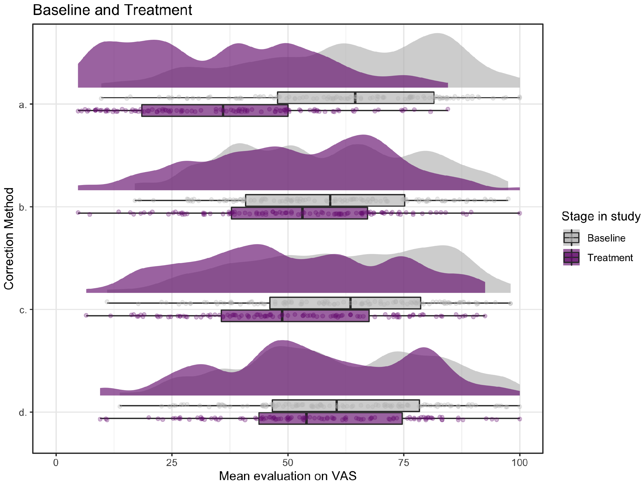
The participants’ mean evaluations of the misleading, corrected, and accurate graphs in each of the five different stages in the study are visualized by the raincloud plots in Figure 11 . The raincloud plots consist of a density plot and a box plot with the jittered means. The height of the density plot reflects the number of responses with the corresponding score on the horizontal axis, the jitter plot shows the individual scores, and the box plot shows their minimum, maximum, median and quartiles.
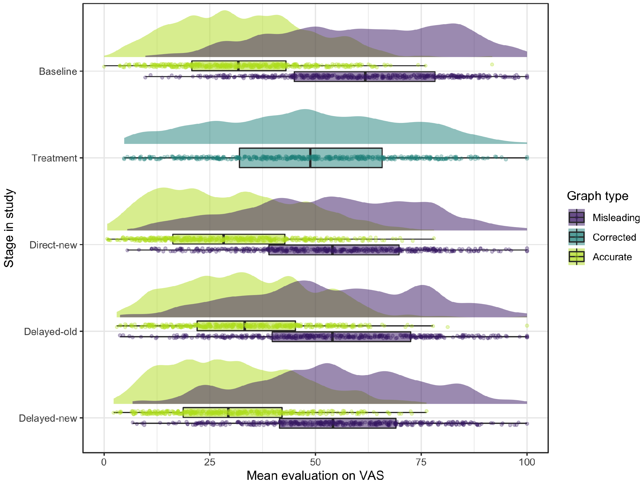
The mean evaluations of the graphs with a misleading y-axis were all found to be higher than the mean evaluations of the accurate graphs on the same context evaluated by the other group. This difference in evaluations also shows in the raincloud plots in Figure 11 where in each stage of the study the misleading graphs (in purple) in general have a higher evaluation on the VAS scale than the accurate graphs (in light green). These results indicate that the cut-off y-axes were indeed misleading.
4.2 Debunking strategies: direct and long-term effects of correction on the same graphs
Hypothesis 1. A comparison of the purple raincloud plot for the measure at Baseline and the dark green plot at Treatment in Figure 11 suggests that corrections of misleading graphs directly lead to lower perceived differences compared to the initial perceptions of the same misleading graphs. This effect is also shown by the negative mean of the correction scores ( , ). As this mean is significantly lower than zero ( , ), the findings confirm our first hypothesis that a correction had a significant direct effect of lowering the initial evaluation score of misleading graphs.
Hypothesis 2. As shown by the purple raincloud plots for the measure at Baseline and the Delayed-old measure in Figure 11 , when confronted with the same misleading graphs one week later, the correction effects persisted for about 50%, namely to a mean correction score of ( ). Although the difference is smaller than at correction, this mean correction score after one week is significantly lower than zero ( , ), confirming our second hypothesis that corrections of misleading graphs after one week led to lower perceived differences compared to the initial perception of the same misleading graphs.
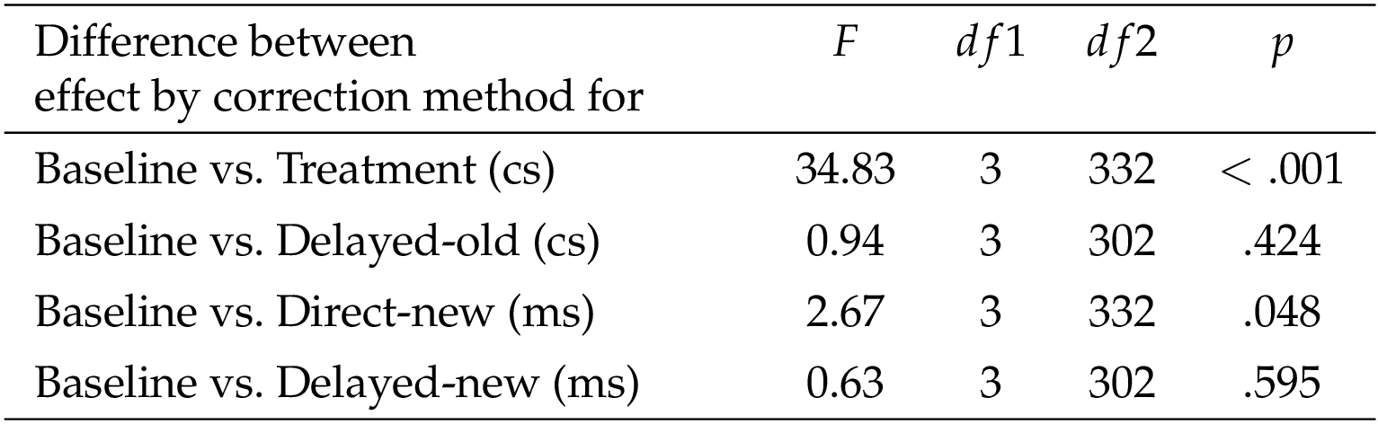
To explore which correction method had the most effect at treatment and one week later for the same graphs, we display their evaluations on the VAS scale per correction method (a–d) at treatment and one week after correction (see Figure 12 and Figure 14 in appendix B , graphs a and b). These visualizations indicate that the method we developed to correct in the first phase of graph perception, method a showing the accurate alternative, had the largest effect at treatment but after one week this difference was diminished and all correction methods resulted in comparable evaluations of the graphs. ANOVA tests confirm these findings, with indeed a significant difference in effect between correction methods at treatment ( , , not preregistered), but no significant differences between the methods after one week ( , , not preregistered). Post hoc Tukey tests on the correction effect at treatment confirm that correction aimed at the first phase in graph perception (method a) results in a significantly higher correction effect at treatment than the other three methods aimed at the second phase (methods b, c, and d), and that there are no significant differences among the latter three methods.
4.3 Protection from misinformation: direct and long-term effect of correction on new graphs
Hypotheses 3 and 4. The evaluations of the new misleading graphs directly after treatment (Direct-new) and one week after correction (Delayed-new) are shown by the purple raincloud plots in Figure 11 . If compared to the evaluations of misleading graphs before the treatment (Baseline, in purple), we see that, on average, the corrections of the graphs reduced the evaluation scores directly after treatment. This effect still shows after one week. In line with this observation, the misled scores of the new misleading graphs both directly after treatment ( , ) and one week later ( , ) were found to be significantly lower ( , , and , , respectively) than the misled scores of the first presented misleading graphs before the corrections ( , ). These findings confirm our third and fourth hypothesis that corrections of misleading graphs led to lower perceived differences in new misleading graphs compared to perceptions of priorly evaluated misleading graphs, both directly after the treatment as well as after one week.
Hypothesis 5. The visualizations of the correction methods’ effects on the evaluations of new graphs directly after treatment (Direct-new) and after one week (Delayed-new) are shown in Figure 14 in appendix B (graphs c and d). These indicate that the text-based cue to activate graph literacy skills (method c) has the strongest effect on new graphs directly after treatment (confirmed by ANOVA on the difference in misled scores, , and post hoc Tukey tests, not preregistered), although this effect is much smaller than the effect of showing the accurate alternative (method a) at treatment. After one week, there is no significant difference between the effect of the correction methods on new graphs anymore ( , , preregistered).
Other results from preregistered analyses and further observations: remaining preregistered analyses are summarized in appendix C . Excluding non-misled participants from the analysis does not change the overall picture, but only shows stronger correction effects. Furthermore, we observe in Figure 11 (green graphs) that the correction methods not only influenced the evaluation of new misleading graphs, but that the difference between the bars in accurate graphs following the treatment was also evaluated lower than for the accurate graphs evaluated at Baseline.
4.4 Additional analyses on gender, graph literacy and educational level
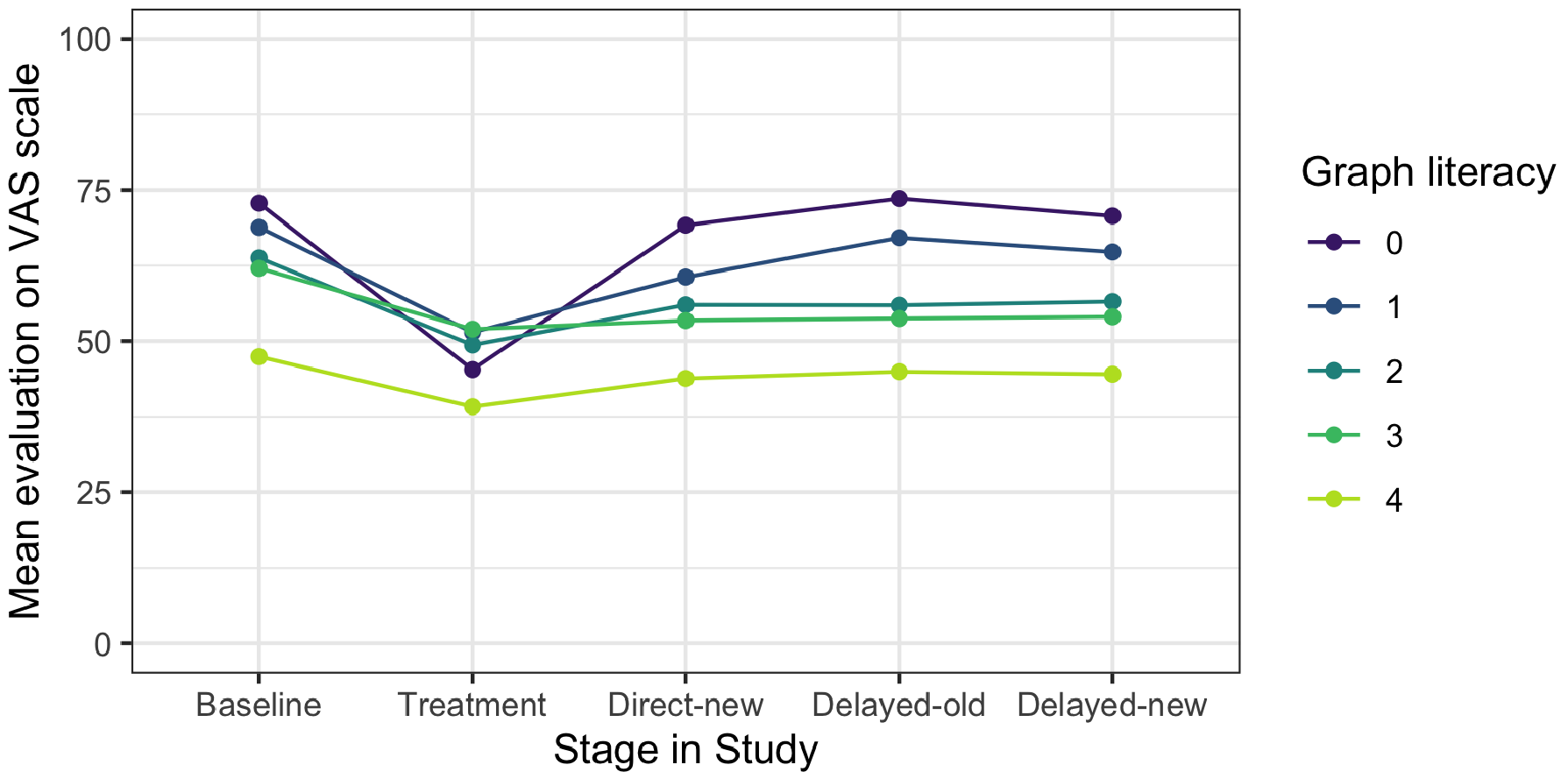
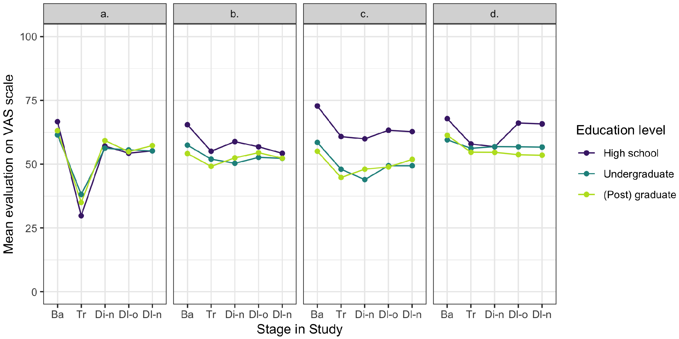
The multilevel analysis confirms our expectation that time was the dominant factor for explaining differences in evaluation scores (67%), indicating that all correction methods were effective as treatments. Furthermore, 54% of the variance in the outcomes could be explained by the participants’ individual differences, with significant main effects of gender and graph literacy. An interaction effect is found between the correction methods and the participants’ educational level (see appendix D for details).
5 Conclusion and discussion
5.1 Discussion of the main findings
Data visualizations can concisely and powerfully communicate complex information because they are instantly encoded in the automatic and unconscious process of people’s intuitive perception. However, as is the case with reading, a closer look would bring about more and more accurate information than a quick skim can bring. Because of this instant processing, the advantage of using this easy-to-understand form of communication in an information-dense world where time is scarce is overshadowed by the potentially significant drawback of hasty reading: the ease of misunderstanding or even of purposeful deceit.
We set up our study to investigate how we can stimulate closer reading of data visualizations by offering different types of corrections of misleading graphs to minimize misunderstanding and prevent deceit. In our design we focused on two strategies for debunking misleading bar charts, being the correction of the misleading initial perception of visual elements in the first phase of processing, and the stimulation of accurate reading and analysis in the second phase. The correction method we developed for the first strategy was the presentation of an accurate alternative to the misleading graph (correction method a). For the second strategy we developed three correction methods of which two were to activate the participants’ graph literacy skills (visual cue in correction method b; text-based cue in correction method c), and one was to activate the participants’ critical thinking skills by warning for biased communication and possible deceit (text-based cue in correction method d).
The evaluations of the corrected graphs showed a drop in the perceived difference between the bars in the bar charts for all correction methods, indicating that they were all effective for debunking misinformation. Although the effect of the corrections is quite strong directly after correction, the effect reduces over time; after one week we still observe a difference, but it is much smaller. These findings confirmed our first two hypotheses that corrections of misleading graphs directly and after one week led to lower perceived differences compared to the initial perception of the same misleading graphs. The method showing the accurate alternative (method a) proved to be the most effective one at treatment. After one week, all correction methods showed a similar effect. From these results we can conclude that in our experiment correction of the deceiving visual patterns that are picked up in the first phase of graph reading was the most effective strategy to directly debunk misinformation.
The results just discussed show that all our correction methods were effective for countering misleading graphs to some extent, however, their effects also showed in the evaluation of accurate graphs following the treatment. As is confirmed by prior research [ Clayton et al., 2020 ; Lewandowsky et al., 2020 ; Maertens et al., 2021 ], warning readers for possible deceit causes them to be more careful and to judge information more reserved in general and not only when confronted with misleading messages.
We anticipated this effect of readers getting less susceptible to misinformation by repeated exposure to factchecks, and thus we also investigated the effects of our correction methods on new misleading graphs, and for how long the effects lasted. The results showed confirmations of our third and fourth hypotheses, that corrections of misleading graphs directly and after one week led to lower perceived differences in new misleading graphs compared to perceptions of priorly evaluated misleading graphs. The results showed no significant differences between the four correction methods after one week (hypothesis 5).
5.2 Limitations and future research
In the study we set up to investigate how misleading graphs can be effectively debunked, we limited ourselves to the use of bar charts, because they are commonly used, and they relate well to the two-phase process perception theory we were interested to explore. However, unintentional misinformation and purposeful deceit due to unconventional graph design are not limited to bar charts. Whether our correction methods can also be effectively applied to other types of graphs requires further research.
The graphs we designed for our study were all based on real data drawn from the WHO data collection and were purposefully selected to deal with real but non-current issues and to stay away from political or otherwise “hot” topics. We reasoned that this choice would minimize the chances of participants’ personal beliefs to disproportionally interfere with their evaluations of the differences between the bars in the graphs. For the same reason, we did use headlines to mimic common designs of graphs used in news media, but we purposefully avoided insinuating or subjective statements. Contrarily, in real news media, topics are always current, and often insinuating or political. A follow-up study using the same set-up but with the use of current and/or political context could further inform us about the influence of peoples’ personal beliefs on their evaluation of misleading graphs.
Apart from the contexts we used for our graphs, the lab setting we used was also limitedly realistic. The lab setting enabled us to better control the variables influencing the results but rerunning the study in a real setting would give better insights in the correction effects in real life, for example on the effects of sender information.
To investigate the sustainability of our treatments, we followed up our initial data collection with a second collection one week later. We found that the effects of correction somewhat faded but were clearly still present. A more extensive longitudinal research study could shed light on the sustainability of the effects over a longer period.
The participants that took part in our study were recruited by Prolific and were selected to form a representative U.S. sample regarding gender, age, and ethnicity. Graph literacy and education were not regarded for representative sampling, so we included a question on highest educational level and a test to measure graph literacy in our first survey. The results showed that our sample was educated above the U.S. average, and that their graph literacy was medium to high. We do believe the outcomes of the graph literacy test need to be taken with some reserves, as it could be that our participants have seen this four-item test before in other surveys on Prolific, possibly leading to a slightly distorted picture. However, research studies on graph reading in general tend to include disproportionately more highly educated and/or graph literate participants [ Durand, Yen, O’Malley, Elwyn & Mancini, 2020 ], while it can be expected that graph reading is especially challenging for the less educated and graph literates. In our follow-up study we therefore aim to specifically target less educated people to further explore the debunking of misleading graphs.
5.3 Conclusions and recommendations
The findings of our study give leads to believe that it is possible to debunk misleading graphs by offering some form of correction. We tested four types of correction, of which the one aiming for correcting the initial perception of the visual cues (correction method a) showed the greatest effect.
Debunking misinformation is a task that is vital to the survival of democracy, especially nowadays when misleading graphs are increasingly part of the spread of misinformation. We recommend news media and creators of data visualizations in general to define clear and strict guidelines on proper graph design if they have not done so already, to avoid the unintentional production and spreading of misleading graphs. We also encourage readers to report improper graph design whenever they encounter them, and we ask creators of these graphs to correct it whenever possible.
Acknowledgments
This research was supported by Leiden University Fund ( http://www.luf.nl , LUF Lustrum Grant 2020, W20719-1-LLS). We thank students Fabian Rozendaal and Rianne Soldaat for performing the multilevel analysis.
A The Short Graph Literacy scale
B Evaluations of the misleading graphs for each correction method
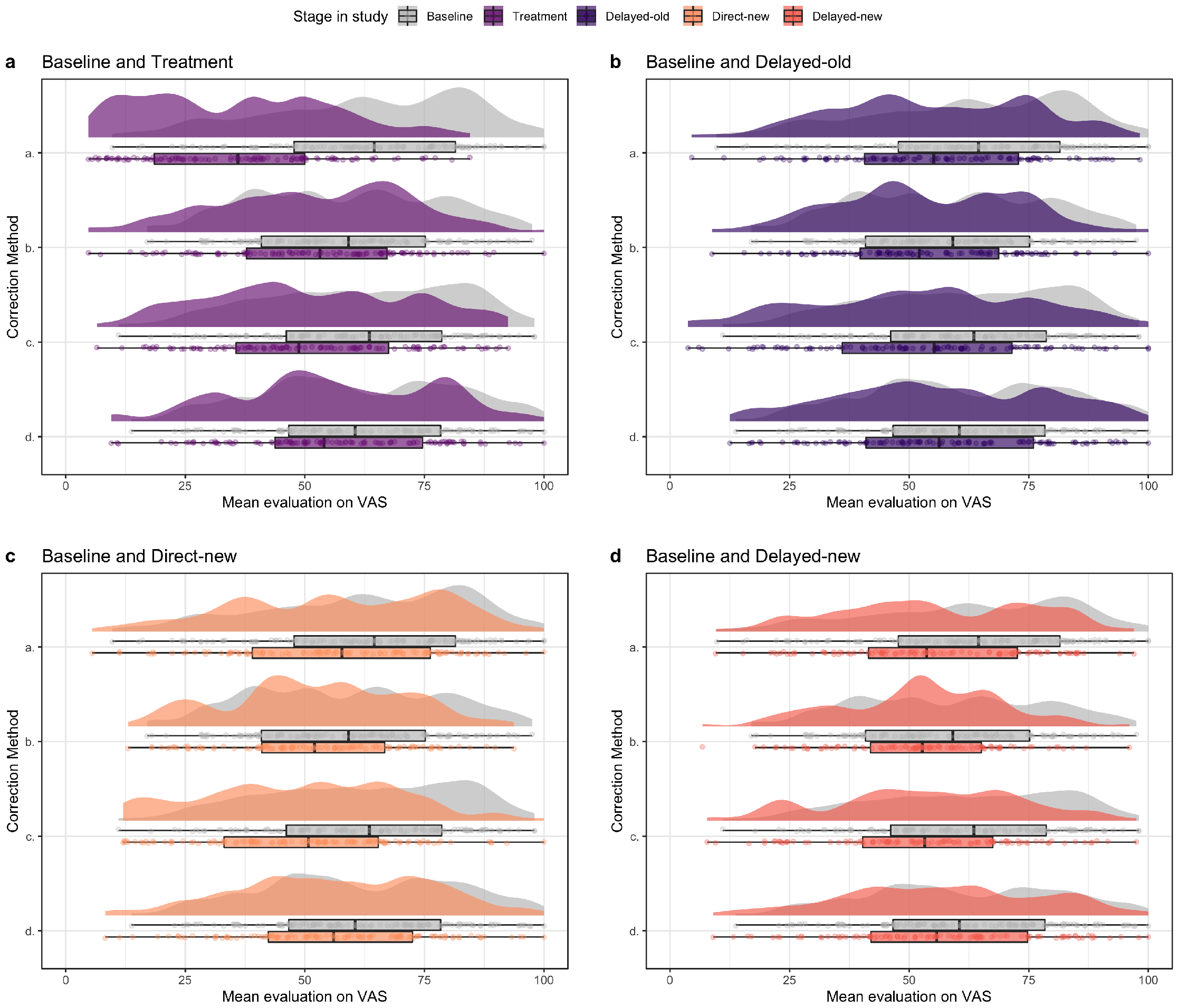
a. Comparison as in hypothesis 1 (H1): misleading graphs before treatment (Baseline, in grey) and the corrections of these misleading graphs (Treatment, in purple).
b. H2: misleading graphs before treatment (Baseline, in grey) and the same misleading graphs one week later (Delayed-old, in dark purple).
c. H3: misleading graphs before treatment (Baseline, in grey) and new misleading graphs directly after treatment (Directly-new, in orange).
d. H4: misleading graphs before treatment (Baseline, in grey) and new misleading graphs one week later (Delayed-new, in dark orange).
C Further results from preregistered analyses
C.1 Are the graphs with a cut-off y-axis indeed misleading?
To check whether the cut-off y-axis in the graphs presented at the Baseline stage was indeed misleading, we compare the mean evaluations of all single misleading graphs with the mean evaluations of their related accurate graphs displaying the same context in the other group in an independent two-sided t -test per context (with Holm-Bonferroni correction for multiple testing). All the tests were significant, indicating that all misleading graphs were indeed misleading to some extent, and thus no context was excluded from further analyses.
C.2 Are some contexts more influential than others?
To explore any structural influence on the mean of the series presented at Baseline by one context, we preregistered to calculate the Z -scores of all evaluations of the accurate graphs presented at the Baseline stage to look for outliers and consider exclusion of contexts. There were 11 outliers (absolute Z -score ), with a maximum of 8 within one context. As this amount is less than 4% of all observations, we decided to not exclude this context and thus base the means on all four contexts per graph type.
C.3 How effective are the correction methods for participants who were originally misled?
For exploratory purposes, we ran all the analyses from the main paper again to determine how effective the correction methods were with exclusion of the participants that had originally not been misled by the misleading graphs. This extra analysis generates a cleaner picture of the correction effect and of which of the four correction methods were most effective. To determine which participants were misled, we calculate the misled scores for each of the four misleading graphs at Baseline for each participant. Participants that showed at least three misled scores of 5 points or more were regarded as being misled. With this definition, 336 (76%) participants were misled and 105 were not misled (24%).
The results of the t -tests testing the effect of correcting misleading graphs (H1–H4) on only misled participants are shown in Table 2 . We observe similar effects as for the full sample, but the effects are stronger.
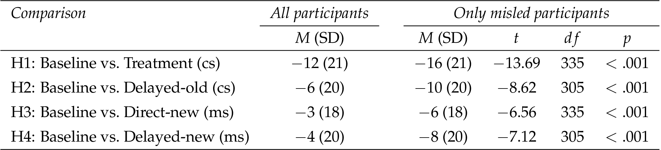
As in the results from the analysis with participants who were not misled, we see that the corrections influenced both similar and new graphs, both at treatment or directly after treatment, and a week later. The difference between the analyses is that the effects are stronger (larger differences on VAS scale) if we focus on misled participants only.
According to the ANOVA results in Table 3 , there was only a difference between the correction methods at correction (Treatment). Post hoc Tukey tests on the correction effect at Treatment show that correction method a results in a significantly higher correction effect at Treatment than the other three methods (b, c, and d), and that there are no significant differences among the latter three methods. The difference between method a and the other three methods is larger than in the analysis including participants who were not misled.
D Additional analyses on gender, graph literacy and educational level
As reported in the main text, the multilevel analysis showed that 54% of the variance in the outcomes could be explained by the participants’ individual differences, with significant main effects of gender and graph literacy. A closer look showed that on average females reported higher scores than males at all stages but with a similar progression over time. On average lower graph literacy was associated with higher reported scores at all stages but with a similar progression over time for all levels, except for at Treatment where results showed that the lower the graph literacy of the participants, the bigger the effect is of correction (see Figure 15 ). The found significant interaction effects between the correction methods and the participants’ educational level is between high school level and correction method c compared to (post) graduate level (see Figure 16 ).
References
-
Bertin, J. (1983). Semiology of graphics: diagrams, networks, maps . Redlands, CA, U.S.A.: ESRI Press.
-
Bryan, J. (1995). Seven types of distortion: a taxonomy of manipulative techniques used in charts and graphs. Journal of Technical Writing and Communication 25 (2), 127–179. doi: 10.2190/pxqq-ae0k-eqcj-06f0
-
Cairo, A. (2019). How charts lie: getting smarter about visual information . New York, NY, U.S.A.: W.W. Norton & Company.
-
Carpenter, P. A. & Shah, P. (1998). A model of the perceptual and conceptual processes in graph comprehension. Journal of Experimental Psychology: Applied 4 (2), 75–100. doi: 10.1037/1076-898x.4.2.75
-
Clayton, K., Blair, S., Busam, J. A., Forstner, S., Glance, J., Green, G., … Nyhan, B. (2020). Real solutions for fake news? Measuring the effectiveness of general warnings and fact-check tags in reducing belief in false stories on social media. Political Behavior 42 (4), 1073–1095. doi: 10.1007/s11109-019-09533-0
-
Cleveland, W. S. & McGill, R. (1984). Graphical perception: theory, experimentation, and application to the development of graphical methods. Journal of the American Statistical Association 79 (387), 531–554. doi: 10.1080/01621459.1984.10478080
-
Curcio, F. R. (1987). Comprehension of mathematical relationships expressed in graphs. Journal for Research in Mathematics Education 18 (5), 382–393. doi: 10.5951/jresematheduc.18.5.0382
-
de Sola, J. (2021). Science in the media: the scientific community’s perception of the COVID-19 media coverage in Spain. JCOM 20 (02), A08. doi: 10.22323/2.20020208
-
Durand, M.-A., Yen, R. W., O’Malley, J., Elwyn, G. & Mancini, J. (2020). Graph literacy matters: examining the association between graph literacy, health literacy, and numeracy in a Medicaid eligible population. PLoS ONE 15 (11), e0241844. doi: 10.1371/journal.pone.0241844
-
Ecker, U. K. H., O’Reilly, Z., Reid, J. S. & Chang, E. P. (2020). The effectiveness of short-format refutational fact-checks. British Journal of Psychology 111 (1), 36–54. doi: 10.1111/bjop.12383
-
Franconeri, S. L., Padilla, L. M., Shah, P., Zacks, J. M. & Hullman, J. (2021). The science of visual data communication: what works. Psychological Science in the Public Interest 22 (3), 110–161. doi: 10.1177/15291006211051956
-
Galesic, M. & Garcia-Retamero, R. (2011). Graph literacy: a cross-cultural comparison. Medical Decision Making 31 (3), 444–457. doi: 10.1177/0272989x10373805
-
Jayasinghe, R., Ranasinghe, S., Jayarajah, U. & Seneviratne, S. (2020). Quality of online information for the general public on COVID-19. Patient Education and Counseling 103 (12), 2594–2597. doi: 10.1016/j.pec.2020.08.001
-
Kelleher, C. & Wagener, T. (2011). Ten guidelines for effective data visualization in scientific publications. Environmental Modelling & Software 26 (6), 822–827. doi: 10.1016/j.envsoft.2010.12.006
-
Lewandowsky, S., Cook, J., Ecker, U. K. H., Albarracín, D., Amazeen, M. A., Kendeou, P., … Zaragoza, M. S. (2020). The debunking handbook 2020 . doi: 10.17910/B7.1182
-
Maertens, R., Roozenbeek, J., Basol, M. & van der Linden, S. (2021). Long-term effectiveness of inoculation against misinformation: three longitudinal experiments. Journal of Experimental Psychology: Applied 27 (1), 1–16. doi: 10.1037/xap0000315
-
Nieminen, S. & Rapeli, L. (2019). Fighting misperceptions and doubting journalists’ objectivity: a review of fact-checking literature. Political Studies Review 17 (3), 296–309. doi: 10.1177/1478929918786852
-
Okan, Y., Janssen, E., Galesic, M. & Waters, E. A. (2019). Using the short graph literacy scale to predict precursors of health behavior change. Medical Decision Making 39 (3), 183–195. doi: 10.1177/0272989X19829728
-
Pandey, A. V., Manivannan, A., Nov, O., Satterthwaite, M. & Bertini, E. (2014). The persuasive power of data visualization. IEEE Transactions on Visualization and Computer Graphics 20 (12), 2211–2220. doi: 10.1109/tvcg.2014.2346419
-
Pennington, R. & Tuttle, B. (2009). Managing impressions using distorted graphs of income and earnings per share: the role of memory. International Journal of Accounting Information Systems 10 (1), 25–45. doi: 10.1016/j.accinf.2008.10.001
-
Pennycook, G., McPhetres, J., Zhang, Y., Lu, J. G. & Rand, D. G. (2020). Fighting COVID-19 misinformation on social media: experimental evidence for a scalable accuracy-nudge intervention. Psychological Science 31 (7), 770–780. doi: 10.1177/0956797620939054
-
Pinker, S. (1990). A theory of graph comprehension. In R. Freedle (Ed.), Artificial intelligence and the future of testing (pp. 73–126). doi: 10.4324/9781315808178
-
Raschke, R. L. & Steinbart, P. J. (2008). Mitigating the effects of misleading graphs on decisions by educating users about the principles of graph design. Journal of Information Systems 22 (2), 23–52. doi: 10.2308/jis.2008.22.2.23
-
Shah, P. & Hoeffner, J. (2002). Review of graph comprehension research: implications for instruction. Educational Psychology Review 14 (1), 47–69. doi: 10.1023/A:1013180410169
-
Swire-Thompson, B., Cook, J., Butler, L. H., Sanderson, J. A., Lewandowsky, S. & Ecker, U. K. H. (2021). Correction format has a limited role when debunking misinformation. Cognitive Research: Principles and Implications 6 (1), 83. doi: 10.1186/s41235-021-00346-6
-
Szafir, D. A. (2018). The good, the bad, and the biased: five ways visualizations can mislead (and how to fix them). Interactions 25 (4), 26–33. doi: 10.1145/3231772
-
Tufte, E. R. (1983). The visual display of quantitative information . Cheshire, CT, U.S.A.: Graphics Press.
-
van Weert, J. C. M., Alblas, M. C., van Dijk, L. & Jansen, J. (2021). Preference for and understanding of graphs presenting health risk information. The role of age, health literacy, numeracy and graph literacy. Patient Education and Counseling 104 (1), 109–117. doi: 10.1016/j.pec.2020.06.031
-
Walter, N., Cohen, J., Holbert, R. L. & Morag, Y. (2020). Fact-checking: a meta-analysis of what works and for whom. Political Communication 37 (3), 350–375. doi: 10.1080/10584609.2019.1668894
-
Young, D. G., Jamieson, K. H., Poulsen, S. & Goldring, A. (2018). Fact-checking effectiveness as a function of format and tone: evaluating FactCheck.org and FlackCheck.org. Journalism & Mass Communication Quarterly 95 (1), 49–75. doi: 10.1177/1077699017710453
Authors
Winnifred Wijnker is a postdoctoral researcher in the field of science communication at
Leiden University, the Netherlands. She works in interdisciplinary teams and has special
interest in visual representations of science for (informal) science learning and
communication. Her Ph.D. research focused on the potential of film and video to raise
interest for science subjects in secondary education.
ORCID: 0000-0002-5714-7981.
@Winnifrrr
E-mail:
w.wijnker@biology.leidenuniv.nl
.
Ionica Smeets is professor of science communication at Leiden University, the
Netherlands. Her main research interest is bridging the gap between experts and the
general public. She enjoys working in interdisciplinary projects that focus on effective
science communication about a specific topic, ranging from statistics to biodiversity and
from hydrology to health research.
ORCID: 0000-0003-1743-9493.
@ionicasmeets
E-mail:
I.Smeets@biology.leidenuniv.nl
.
Peter Burger is assistant professor of Journalism and New Media at Leiden University,
the Netherlands. His research interests include fact-checking, source use, science writing,
and narrative folklore.
ORCID: 0000-0003-3366-9977.
@JPeterBurger
E-mail:
P.Burger@hum.leidenuniv.nl
.
Sanne Willems is assistant professor at the Methodology & Statistics Unit of the
Institute of Psychology at Leiden University, the Netherlands. She is mainly interested in
(in)numeracy and clear communication of statistics and their uncertainty, and enjoys
working on these topics in interdisciplinary teams.
ORCID: 0000-0002-0000-6387.
@SanneJWWillems
E-mail:
S.J.W.Willems@fsw.leidenuniv.nl
.
Endnotes
1 E.g. https://viz.wtf/ , https://www.statisticshowto.com/probability-and-statistics/descriptive-statistics/misleading-graphs/ , https://venngage.com/blog/misleading-graphs/ or https://towardsdatascience.com/misleading-graphs-e86c8df8c5de .
2 https://www.who.int/data/collections .
3 We used the median instead of the mean because the median is more robust against possible outliers.
4 Note that this calculation is equivalent to first calculating the mean of the evaluations of the misleading graphs presented at the Baseline stage and the mean of the evaluations of the corrected graph at Treatment per participant, and then testing whether on average the mean of the misleading graphs was indeed higher than the mean of the corrected graphs in a one-sided paired t -test.
5 Based on https://educationdata.org/education-attainment-statistics .